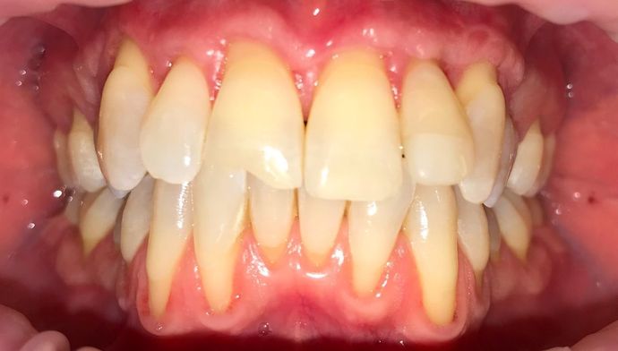
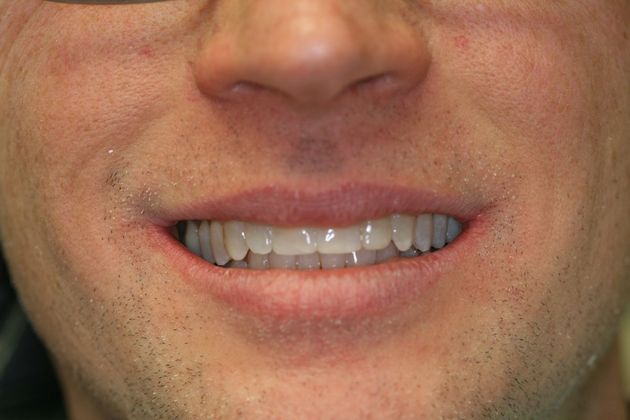
Clear Aligner therapy and Cosmetic Bonding
Related to This
142 Joralemon St Ste 12C Brooklyn Heights, NY 11201
Loading hours...
Rate, Review & Explore
About
General
Restorative
Cosmetic
(718) 625-2116